The Bay Area Digital Humanities Meetup co-hosted an event on data visualization with the Bay Area D3 User Group in January. D3.js is a robust Javascript library for building interactive data visualizations on the web. Utilized by a variety of users in academy, industry, design and journalism, the D3 community is a rich source for interdisciplinary interaction. Both presenters at the meetup emphasized that data visualization is more than illustrative. Instead, data visualization can serve as a powerful, exploratory research tool in investigating data and raising new questions.

Jason Heppler, an Academic Technology Specialist at the Stanford Libraries and PhD candidate in History at the University of Nebraska-Lincoln, shared Geography of the Post. Collaborating with Cameron Blevins, a PhD candidate in History at Stanford, the project sought to visualize the opening and closing of over 14,000 post offices in the American West over the course of the 19th century. Using the post “as a proxy for understanding community”, Jason discussed the granularity achieved by mapping the individual locations of post offices across the West. Unlike census maps, which are created every 10 years, Geography of the Post allows users to examine post offices that opened in mining boom towns and closed within the decade, providing new insight into the extractive industries and movement across the West. Jason also shared the challenges of bringing together a variety of complex data sets, cleaning the data, and designing visualizations that captured the nuances and challenges presented by that data. See Jason’s blog ("Research Design and Geography of the Post" and "Humanistic Approaches to Data Visualization") for a more extended discussion.
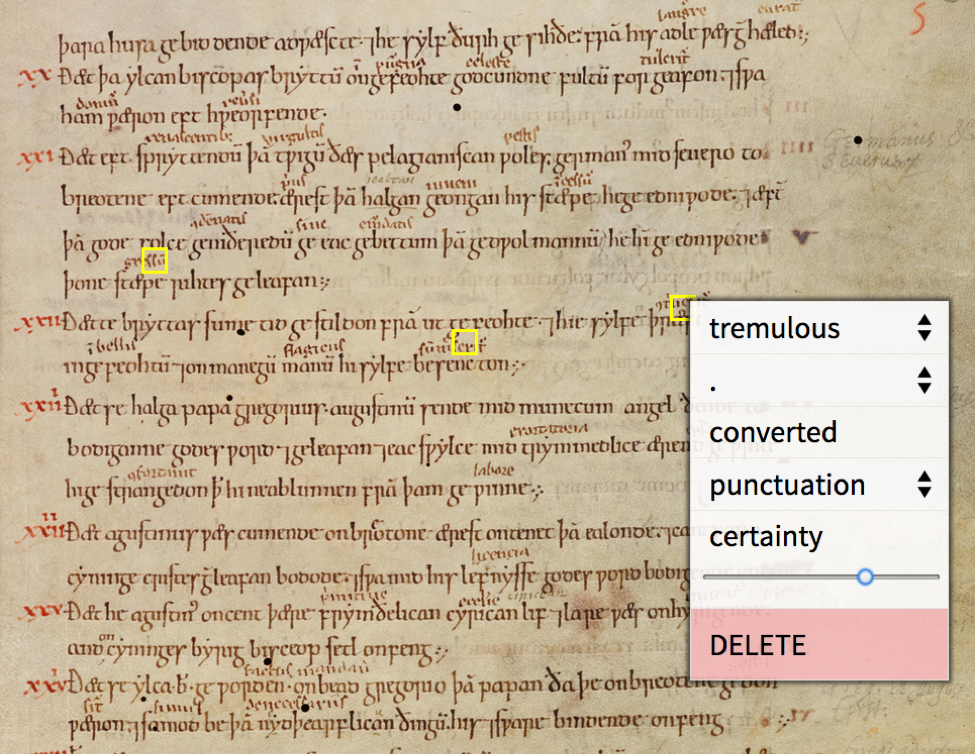
Ian Johnson, co-organizer of the D3 User Group and an engineer at Lever, presented a prototype he developed with his father, David Johnson, a Professor of English at Florida State University, to study punctuation and annotation in medieval documents marked up by The Tremulous Hand of Worcester. Though the project is still in development, Ian noted that the tool has sped up data collection and is a great improvement over David’s earlier workflow, which involved meticulously recording punctuation occurrences and types in spreadsheets. For collaborators interested in tool development for humanistic research, Ian highlighted the value of prototyping rapidly and receiving immediate feedback from David during the project.
Interested in learning more about data visualization? Explore data visualization tools and reviews on DiRT Directory. To experiment with different kinds of data visualization in your browser, try out Palladio, a tool in development at Stanford’s Humanities+Design lab. Palladio utilizes D3.js and allows users to upload data and use a variety of visualizations, such as maps, network graphs, galleries, and timelines. See Miriam Posner of UCLA DH’s discussion of Palladio and some alternatives here.
---
Resources:
- View both presentations on YouTube:
- Jason Heppler, “Humanistic Approaches to Data Visualization
- Ian Johnson, “data-driven manuscripts”
- Join the Bay Area Digital Humanities Meetup
- Read about the last Bay Area DH Meetup hosted at Berkeley