
DH Intern MacKenzie Alessi, a senior undergraduate majoring in Interdisciplinary Field Studies and New Media, spent the summer sharpening her programming skills for two projects at the Berkeley Center for New Media.
Urban Lighting Program
Working with Greg Niemeyer, Associate Professor or Art Practice and New Media, and Pablo Paredes, PhD Candidate in Electrical Engineering and Computer Science, on the Urban Lighting Program, MacKenzie has been conducting research, building data visualizations, and programming a website for an interactive lighting installation in San Leandro. Using sensors and interactive lights installed in a sidewalk. Subjects are exposed to different lighting combinations (e.g. lights turning on before they arrive at the installation, lights turning on as they walk through the installation, etc.). Subjects will fill out a survey and MacKenzie will videotape them as they discuss their reaction to the installation. In partnership with the City of San Leandro, citizens will be able to view and interact with the data collected on a website MacKenzie is in the process of building. Learn more about San Leandro’s interactive arts partnership with the Berkeley Center for New Media and Global Urban Humanities, which debuted last fall at Count Me In: Walking and the City.
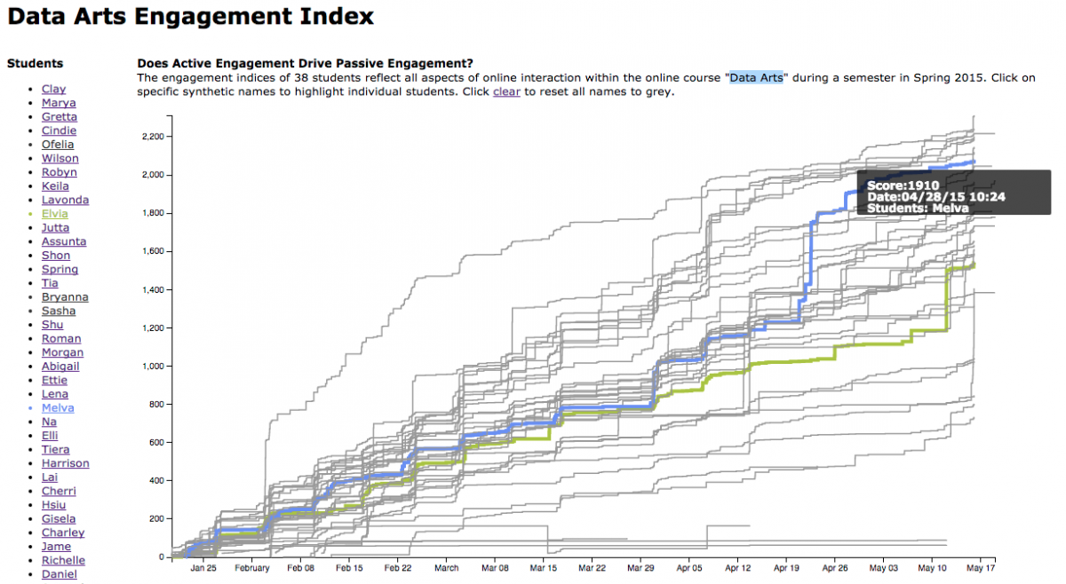
Data Arts
MacKenzie’s second data visualization project has been working with data from Niemeyer’s “Data Arts” class (Art W23AC), which made students aware of their roles as both producers and consumers of data. From the outset of the class, students’ various forms of participation in this online class was measured by a point system that formed their “engagement index.” Actions were broken down into social actions (“liking” another student’s artwork) and prompted actions (graded assignments). Students commenting on another student’s piece might receive 5 points, while the receiving student might receive 3 points. This point system was transparent to students from the beginning of the class, where one of the first assignments was to assess whether the point system was fair. MacKenzie’s work visualizes anonymized class data and analyzes the correlations between different types of student participation (e.g. is there a correlation between exam score and social participation?). View MacKenzie’s data visualizations here.
MacKenzie and Greg will be presenting their work at the DH at Berkeley Summer Institute. RSVP and join us on August 17th at 11AM for “Quantifying Discourse”
|
Advice to interdisciplinary undergraduates
Though computer science classes can be intimidating, MacKenzie encourages other humanities majors to take the leap.
“I’m a huge fan of the breadth courses on this campus. I think CS should be one of the breadth courses you have to take. Coming from a strict humanities background [originally majoring in Philosophy], I was scared of computer science and those courses. But I think that anyone at Berkeley can excel [in these classes], and they shouldn’t be discouraged by the grades they get. Grades don’t necessarily reflect your interest, your intelligence, or your skill.”
Taking one introductory computer science class (CS61A: Structure and Interpretation of Computer Programs) provided a foundation for MacKenzie to dive into data visualization work. “I took CS61A over the summer and it was very difficult, I had never coded something before in my life. It was very scary. I came out of it and I didn’t realize just how much I had learned. I didn’t expect to learn that much or have that much ability to do different things.”
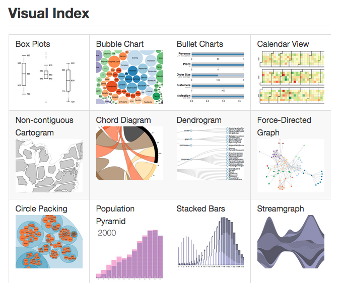
Though she had never programed in Javascript or used d3.js (a popular Javascript library for creating interactive data visualizations), MacKenzie was able to teach herself the basics over the course of the summer. For both of her projects, MacKenzie explained that she made sure to take advantage of the templates provided in the d3.js examples gallery and solutions on Stack Overflow. “Data visualization is tedious, but there’s so much open source stuff out there that...as long as you formulate the data and parse it in the right way, visualizing it is not that difficult. Manipulating the data is the hardest part of it.”
MacKenzie hopes to study abroad in France and attend Sciences Po in the spring. In her ISF thesis, she plans to combine perspectives from legal studies, rhetoric, and new media and incorporate classes from School of Information related to data privacy.
===
Images: (1) Data visualization from the Data Arts Engagement Index (2) Sample of d3.js data visualization templates