Note: This resource guide is derived from a series of blog posts written by Brendan Mackie, a PhD student in History at UC Berkeley. For context, as well as a general discussion about the applicability of content analysis to humanistic research, please see his introductory blog post on content analysis.
Part 1: A Humanistic Map To A Content Analysis Project
In this section, I am going to map out the different stages of a content analysis project. This will be an adaptation (much reduced) of the flowchart found in Neuendorf's content analysis Textbook.
First off, start with a good question. Digital humanities methods are great tools—the challenge is in using them to make great scholarship. Content analysis works particularly well with looking at the often-glacial changes in social practices over time periods larger than a human lifetime. As the more humanists gain expertise in content analysis, we will hopefully find new questions to play with.
Then, seek out some kind of body of texts to look through. You need either a preexisting corpus of material or a way of selecting material to build this corpus. You also need some way of sorting through this corpus so you know what material you will be coding.
Next, determine which variables you are going to be looking for. Broadly, in my own work I code for demographic variables and descriptive variables.
Then code! This means that you read your documents and assign codes to each one. These two steps will be outlined in part three
Finally, you’re ready for visualization and analysis.
Part 2: Data Collection
You have your research question in hand, and you think a content analysis approach might be useful. What’s next?
The first step is to select which data you want to be working with—your so-called corpus. This can be a certain kind of source: diaries entries on December 25th written in the British Isles from 1688 to 1850. Alternatively, it can be a certain section of an archive: court cases resulting in a hanging. You may also use search terms to hone in on documents in an larger archive mentioning a particular word or set of words. In a previous project I found descriptions of London coffeehouses by searching online archives for material mentioning the word ‘coffee.’ You may also combine multiple archives into one project, if you are careful with how you use balance the different biases of each.
Where do you find all this text? There are many digital corpuses available, some of which have reliable text searching capability. In the British context (the one I know best) there is an embarrassment of riches—London Lives, ECCO, the Burney Collection and other fully-searchable archives are all available to most academic institutions. But you don’t need to use digital material! You can just as easily code printed books, sheet music, or paintings.
A side note: Remember to be very wary about how you use search in digital archives. It is easy to think of search as a flat mirror of the archive, but search engines have their own philosophical assumptions, often occluded under a miasma of proprietary algorithms. My tips are as follows: Search for words with fewer letters, to reduce the chances of OCR errors. (The longer your word or phrase, the greater chance that OCR will garble it up.) Avoid words with the dreaded long s that can confuse OCR. Be aware that the absence of mentions of a term over a long period of time might not be reflective of the actual practice itself, but rather a change in the use of words describing that practice.
Next, you should consider whether the corpus you’ve collected is the right size. The longer a time period you are working with, the more sources you need. If you don’t have a very large corpus (and I would prefer to have more than ten observations per year at the very least) think about expanding your corpus. But not too much. Content analysis is incredibly time-consuming, as it involves hand-coding each and every instance of the terms you are dealing with. If your selection process has given you way too much data, you can select a random sample of it. (Use a statistical significance calculator to figure out how many entries you need.) Even doing this, the whole process will likely take solid weeks of work.
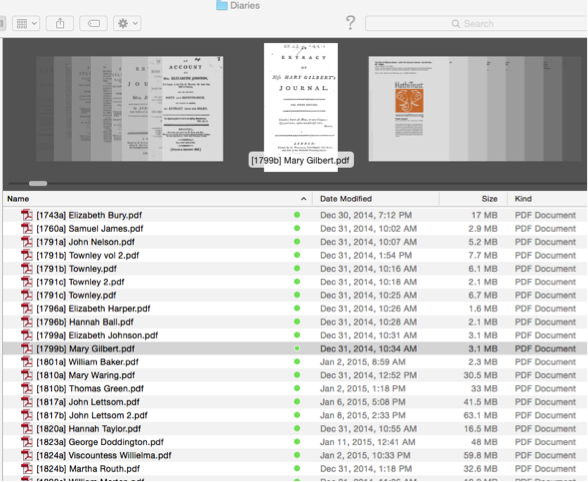
Once you have selected your data collection method, download your sources and assign each document a unique ID. In my Christmas project, I have done this by date of publication, as you can see here.
If manually downloading thousands of books doesn’t appeal to you, keep in mind that some intrepid scholars have written scripts that can help you automate the process. You will likely need some familiarity with coding to take full advantage of these tools, and many are in dubious standing with archives’ Terms of Service.
Now that you have built up your little library of digital (and dead-tree) books, it’s time to jump into coding!
Part 3: Coding
“Oh God, I could be bounded in a nut shell and count myself a king of infinite space."
Digital humanities has often been described as a kind of ‘distant reading.’ In traditional close reading the scholar contemplates every last comma. But in distant reading hundreds of thousands of documents are dispatched in the time it takes your computer to crunch a few billion calculations. What is content analysis?
Content analysis is mid-way between close and distant reading. The scholar still reads—but she reads only a small portion of each text relating to the activity in question. The scholar uses computers and statistics to crunch the data—but the meaning remains something she has given to the data herself. If ‘mid-range reading’ didn’t sound so silly, it’d be apt.
Coding is the hardest part of the content analysis workflow, the point where method becomes more art than science. Coding your data flattens it, irons out its particularities, smoothes clean the distinctive wrinkles humanists usually have so much fun analyzing. What’s more, coding threatens to lock much of our interpretive work in a black box of numbers and codebooks. But finding regularities in large amounts of your material does not necessarily blind us to variety or difference. It allows us to zoom out—to see things from a perspective that might be otherwise hard to get hold of. As content analysis visualizations improve, it will be possible to link each datapoint with the exact quote it is derived from, leading to the option for scholars to critique one another's coding strategies. The black box will soon be opened.
Coding Workflow
Before I delve into the more technical considerations, it may be helpful to lay out how I go about coding my material.
I open up an Excel document where I keep my records. I use Excel simply because I am familiar with it—other data management programs (like Access and LibriOffice) may be more appropriate. Then I open up one of my target documents and find an observation of the practice I’m looking for. This gets a unique identifier I call an INSTANCE. Then I code what this instance is saying, and the place of observation if applicable. Then I record the citation this instance is connected to. When I am finished with the document, I also code in the writer’s name, religious denomination, and class. Each of these is kept in separate fields in my excel spreadsheet.
Each field is connected to other fields by a set of common variables. Some fields are linked to one another by a shared ‘instance’. (Instance 1 might have a ‘CODE’ of ‘DINE’ and in another field have a ‘PERSON’ of ‘William Bagshawe.) Other fields are linked together by a shared ‘person.’ (‘William Bagshawe’ might have an entry in the ‘gender’ field: male.)
Let’s take a closer look at this whole process.
What to code
Before anything else, you should think about what sort of material you need to discover to answer your research questions. I find it helpful to separate this material into two categories: observations and demographics.
Observations are the behavior you are trying to describe. This can be the activity in coffeehouses, Christmas rituals, the amount of money mentioned in a text, or the mood of a poem.
Demographics are the ‘metadata’ surrounding each observation. The most obvious variable to keep track of is date. But you can also code for gender of observer, place of observation, social class of observer, and so on. You also need to include enough information in each observation so that other people will know where you’re getting your data from. That means that every observation should be connected to a reference. I do this by recording two variables: citation, with the actual page number, and source, which has the code standing for the book the reference is gleaned from. (Remember those codes we gave our books when we downloaded them? They come in handy now.)
Setting Up Your Excel Sheet
So where does coding happen? You can do it in many programs, but I use Excel—not because it is the most advanced, or the best suited for this particular project. I just know it the best. It is also helpful that you can find Excel on almost every computer you come across.
Before we start coding, we need set up our spreadsheet. The problem is that we are used to making spreadsheets that humans can read, but it’s a lot easier in the long run to make spreadsheets that computers can read.
When I think of a spreadsheet, I think of something like this:
A human reads this spreadsheet from left to right, clearly seeing which data belongs to which observation. Instance 10 is of a male lawyer in London named Daniel O'Connell who, in 1796, does not mention Christmas. You can check page 91 of book 1906a to see the diary entry I derived this data from.
The problem is that computers don’t like this kind of database architecture. What they like is ‘tidy’ data. In the words of Hadley Wickham “Tidy datasets are easy to manipulate, model and visualise, and have a specific structure: each variable is a column, each observation is a row, and each type of observational unit is a table.”
The data above are NOT tidy. Although each observation is a row and each variable is a column, the observational units are not split out by table.
So instead of a single sheet jammed full of data, we have to imagine a number of sheets, all of which interact relationally. (A so-called ‘relational database’) Each ‘table’ (a sheet in Excel, also sometimes called a ‘field’) is a different observational unit—religious denomination, year, and so on. Each row gets its own observation. And each column is its own variable.
It is often helpful to understand your relational database visually: every ‘field’ (each tab in Excel) is related to other ‘fields’ by shared variables. It is important to keep the names of your shared variables EXACTLY THE SAME otherwise you’ll have complications later. (There are programs available for turning a human database into a relational database, but why not start out on the right foot?)
Much work has been done on how to keep your data tidy—consult these if you’re curious about how to make your database. There are also some computer programs, like Data Wrangler, that can help turn a normal ‘flat’ database into a tidy one, if you need.
Open-ended coding versus pre-coding
Now that you have your relational database set up, it is time for the fun part: actually reading and coding your material.
But before you do this, a huge question arises: what do you code? How do you ball the infinite variety and difference of human life into a dozen marbles of rigid 'codes'? There are two options.
The first is called open ended coding. In this method, you write brief descriptions of each practice as you go along. After a certain amount of time, you go back over these and impose a kind of order, balling up particular descriptions into a limited number of broader categories. I prefer to do this at the very end of the coding process, but to each his own.
The second approach is called pre-coding. In this method, the researcher comes up with a pre-determined set of codes before she starts looking at her data.
Whatever you do, make a list of your codes and write a description of each one. This is called a codebook. I like to keep representative quotes of each practice alongside my definitions as well.
There are benefits and drawbacks to each approach. Open-ended coding leaves your research more open to the sources themselves. It also means that you are not pre-judging the material. The downside, however, is that it adds a hugely time-consuming step to an already mind-numbingly-tedious process: you have to go back through your notes after you’ve read everything and impose a set of codes over your inevitably sometimes thin notes. Pre-coding is faster, and it allows collaborative work because you are working from a clear set of definitions. However, there is a very real risk that important phenomena will not be included in these pre-determined coding schemes, and so will either have to be ignored, or your code-book updated and the whole process started over again. (This has happened to me. Not fun.)
Working with multiple coders
If you have a codebook handy, you can outsource your coding to others. Qualitative researchers have developed a number of methods for gauging inter-coder reliability. Because I am not familiar with working with other people, I can only point interested people to the fact that this exists.
Text Analysis and Content Analysis?
Inevitably, sometime during the long and frustrating process of coding, you will ask yourself: can’t a computer do this? I am sure that many people reading this will answer yes.
I am nervous about bringing machine learning into the content analysis of historical materials. Although machine learning approaches may be appropriate for data coming from one solid time period, over the incredibly long time spans historians deal with, language changes in a way that machine learning cannot account for. This does not mean that the challenge cannot be met, merely that it awaits more technically adept practitioners than myself.
Part 4: Visualizing your data
Now that your database is ready, it’s time do start crunching numbers! In this section I will ignore most of the fancy statistical analyses available to you; instead we’ll just focus on making a simple visualization: how to display the frequency of a given activity over time using a program called Tableau. Tableau is a professional data visualization tool that has an intuitive user interface. It is also free for students, which is helpful.
Many people have helped me on the technical side of things. Robin Weiss at University of Chicago helped visualize my coffeehouse data, putting me on this bumpy road of data visualization. Matt Francis (@Matt_Francis) made some very beautiful visualizations of my Christmas data. Most importantly for this project, Benjamin Young on the Tableau forums very helpfully walked me through a number of methodological difficulties. I would not be here without their help.
First, you need to tell Tableau how to read your data. When you open up Tableau, click on the big orange ‘connect to data’ button on the upper left.
Now that your data is loaded in, you should see a number of frames. To the left, sheets shows a list of the ‘fields’ from your database. The top frame, where it says ‘Drag sheets here’, is where your fields will go. The bottom frame will show you how your data looks once it is loaded in. If you have ‘flat’ data, that is, a database with only a single field, you will see only a single item in the sheets frame. If you have a relational database, you will see a ton of different fields. Go ahead and start dragging fields from the left frame into the top frame (if you have multiple fields). You can mess up. Tableau is very forgiving—if you make a mistake, you can simply hit the UNDO keystroke combo of your choice, and your work will be restored.
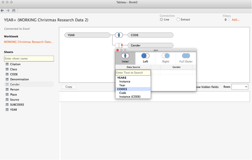
Here’s what mine project looks like after dragging two fields into the main frame:
Notice a few things here. ‘YEAR’ and ‘CODE’ are connected by a little venn diagram symbol. This means that there is a join between them—in other words, the sheet is reading the different fields as connected. Imagine this is the ‘year’ field:
| Instance | Year |
|---|---|
| 3 | 1741 |
| 4 | 1690 |
And here is the ‘Code’ field:
| Instance | Code |
| 3 | DINE |
| 4 | NO |
When you tell Tableau to join the two fields on ‘instance’, you combine the two fields thusly:
|
Instance |
Code |
Year |
|
3 |
DINE |
1741 |
|
4 |
NO |
1690 |
Another thing to notice is that these data are displayed in a spreadsheet in the bottom pane. This is a great place to check whether Tableau is reading your data the way you think Tableau should be reading your data.
Now, not every field is going to be connected with every other field. Try to load in a field that is not connected to your the fields you already have on screen. Uh oh!
You've made Tableau confused. It’s asking you what you want it to do. How do you want the fields to line up? What do you join on? You don’t actually want to join these two fields (probably) so just undo.
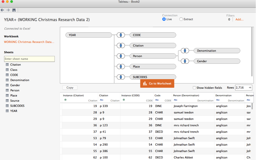
Now load in your data correctly. Here’s what mine looks like.
There’s one more thing to do before your data is ready to go. Remember those little Venn diagrams connecting your different fields? Take another look at them. The inner part is shaded. This means that the join is a ‘inside join.’ This means that you are only loading the records which appear in both fields. This is a little tricky to understand, so let’s take an imaginary example of two fields. One shows the colors of fruits, the others the colors of elements:
|
Fruit |
Color |
|
Apple |
Green |
|
Apple |
Red |
|
Banana |
Yellow |
And here’s another:
|
Color |
Element |
|
Red |
Fire |
|
Blue |
Water |
An inside join would produce this record:
|
Fruit |
Color |
Element |
|
Apple |
Red |
Fire |
Only the records which are present in both fields are pulled.
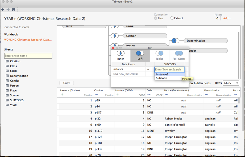
To load in all your data, you likely want to tell Tableau to make ‘left’ joins. This means that you want it to include all of the records in the left-hand field, even if there is no corresponding record in the right-hand field. Do this by clicking on the Venn diagram and selecting ‘left.’ If Tableau is confused about which fields you want it to join by, just tell it manually by selecting from the dropdown menu.
You will notice that the left-hand circle of your Venn diagram symbol is now fully shaded.
Congratulations! Your data is now ready to go. Now for some fun. Click ‘go to workbook.’ Here’s what you’ll see.
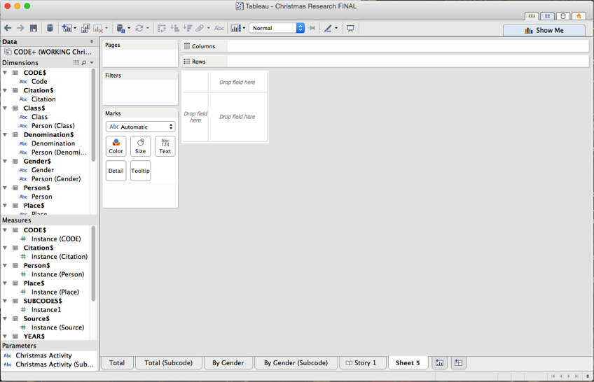
Let’s orient you to the Tableau interface. It looks simple, but there is a TON going on here. The far left frame is partitioned into four fields. The first is data—the data you are working with. The second are your dimensions. Think of these are the data Tableau thinks looks vaguely X-axis-ish. Next is ‘Measures’ These are the data Tableau thinks looks Y-axis-ish. Now you can turn a measure into a dimension and a dimension into a measure simply by dragging one field into another. Be careful with this, though—check Tableau is actually doing what you expect it to do. The fourth field you see is something you probably don’t have—it’s called a parameter, and it acts as a kind of variable you can fiddle with. We'll make some of those later.
To the right is big frame with a lot of different panes. The most important for now are in the center. Take a look at the ‘drop field here’ bit and the ‘columns’ and ‘rows’ bit. Our job right now is to get our data here.
When you’re dealing with straightforward numeric data, this is really easy. Simply drag and drop. Try it with some of your numeric data. Works beautifully! You can select the kind of visualization you want by selecting the ‘show me’ tab in the upper right hand corner. Tableau will show you the visualizations available for the data you’re selecting. This is where playing around with Tableau really begins to feel fun.
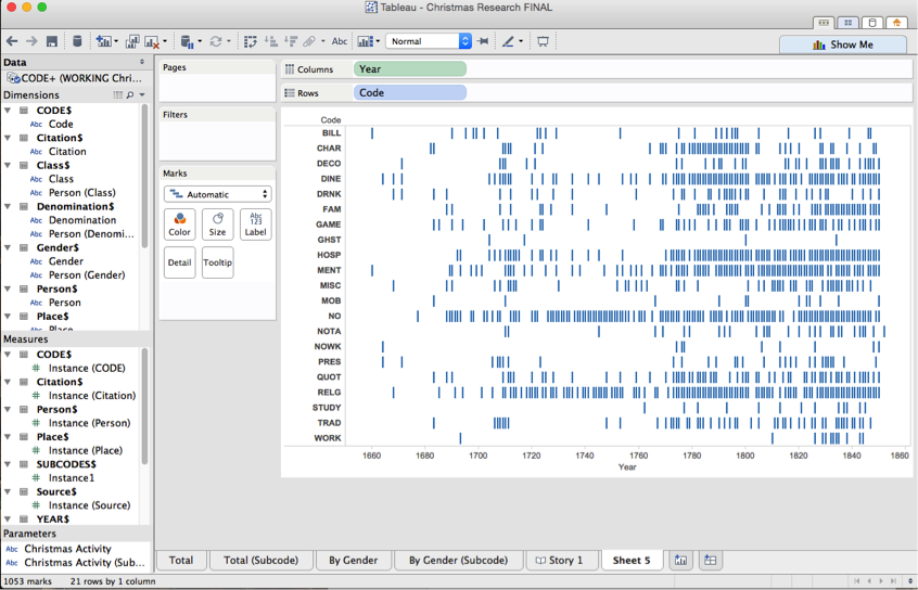
Numeric data may work fine, but content analysis doesn’t count numbers, it counts concepts, which are expressed in ‘strings.’ A string is what computer science people call ‘text.’ Try to display your ‘string’ data—that is, your codes and see what happens.
Chaos!
This is obviously not what you want to do. To make Tableau visualize our data, we are going to need to do something a little bit more complicated than drag and drop. DO NOT FEAR! This is relatively simple with help. And after you do it once, you’ll be able to do it a thousand times without breaking a sweat.
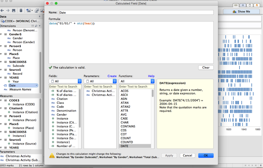
First off, we want to make sure that Tableau understands that our ‘YEAR’ field is actually a date. Tableau wants the date to include the month and day and my data only includes the year. We'll have to fix that. (You won't need to do this if your date information includes days and months.)
Right click on ‘Year’ and go to ‘Create Calculated Field.’ This tells Tableau that you want to make a new field out of an old one.
Now enter in “date("01/01/" + str(Year))” where ‘Year’ is the same name as whatever field contains your date information.
This tells Tableau this: return this date: 01/01/YEAR. Make an evocative name for your date field. Like ‘date’. Anything that will help you remember what it is you are calculating. Do not to call it ‘Calculated field 1’ because then you’re going to be left with a dozen things called 'calculated fields' and you'll feel like a teenager with a messy room looking for the cereal bowl into which he threw his car keys last night. Right click on this new calculated field to make sure it is being read as a ‘date’ not as anything else weird.
Now drag this new Date field into the ‘columns’ section. Click on the chevron next to the name, and select ‘year’ from the dropdown menu. (Or whatever unit you want to organize stuff by.) This tells Tableau to group the data by years, not by months or date.
Next we want to make a parameter which will allow us to select the code we want to analyze by. Right click on CODE in the dimensions pane (or whatever called the field which stored the your codes) and select ‘create parameter.’ You will now have an option to play around with which codes you want to display at any given time. Name this parameter something evocative—‘Code Parameter’ would be nice. Right click in the main window, and select the parameter you just created to make a new window where you can select parameters.
Now you have a drop-down menu from which you can select your chosen code! Shiny!
Now we want to tell Tableau to count our string data. We’re going to create a calculated field from our ‘codes’ field. Do this by right clicking it. Now paste in this, replacing my nomenclature with yours:
countd(if [Code]=[Christmas Activity] then [Instance] end) / countd([Instance])
So replace [Code] with the place where you stored your codes; Christmas Activity with the parameter where you can choose codes; and instance with the unique identifier you gave to every observation.
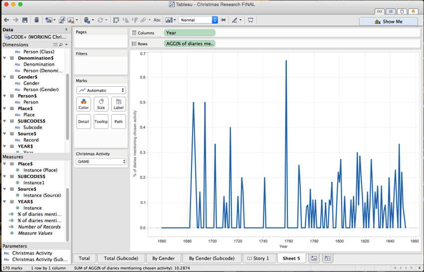
This tells Tableau this: count the distinct number of instances where the field code is equal to the Christmas Activity I’ve selected from my dropdown menu. Then divide this by the total number of distinct entries. (Giving us the particular Christmas activity expressed as a percentage of total activities for each year.) Name this calculated field something descriptive—mine is called ‘% of diaries mentioning activity.’ Now drag it to ‘rows.’
You can now play around with the code you’re looking at my selecting it from your drop-down menu. Don’t you feel like some kind of data super hero? Ready to solve crimes and correct injustice?
If you notice, my graph is really noisy. To deal with this noise, I smoothed my data by creating a moving average. Right click on the ‘codes’ bubble just below ‘DATE’ and select ‘create table calculation’ and then select ‘moving calculation’ and ‘average’ and choose how many years you want this moving average to include.
Now your data should be smoother.
Beautiful!
Try to cut your data by some of your demographics. In my example, I want to look at my data by gender. This is incredibly easy in Tableau. I find my gender dimension, and I simply drag it onto the graph. Now the graph is split out by gender. You can even play with the colors Tableau chooses for each gender.
And now you’re done! If you’ve followed all these steps, you too have your very own content analysis project and you’re in a good enough place where you can play around with Tableau to your heart's content.
That’s it! Get analyzing! And get writing!
